Driving app adoption through better onboarding
An educational onboarding feature for Sonnet's mobile app
Sonnet Shift offered some of the lowest car insurance rates in Ontario through a usage-based program — but customers were canceling within weeks, putting growth 10% behind quarterly targets. I led the research and design that turned the program around with a counterintuitive bet: the right friction, at the right moment, would outperform less friction.
The shipped design
The final design didn't just inform — it created commitment. By requiring users to actively engage with each section, we transformed passive selection into conscious choice.
Users who completed the flow weren't just informed. They were committed. They had invested cognitive effort and made the decision with full awareness.
Impact
UBI App Adoption
First year, +11%
0%
Post-Purchase Cancellations
Down from high churn
0%
Quote-to-Bind Conversion
Despite 30% surcharge
Stable
The right friction, applied at the right moment, outperformed the assumption that simpler is always better.
The problem
Uncovering the “why” behind customer churn
In Q1 2024, customers were purchasing Sonnet Shift policies and canceling within weeks. Operational costs were mounting and growth targets were slipping. I led the research effort to figure out why customers were unintentionally signing up for a product they didn’t actually want.
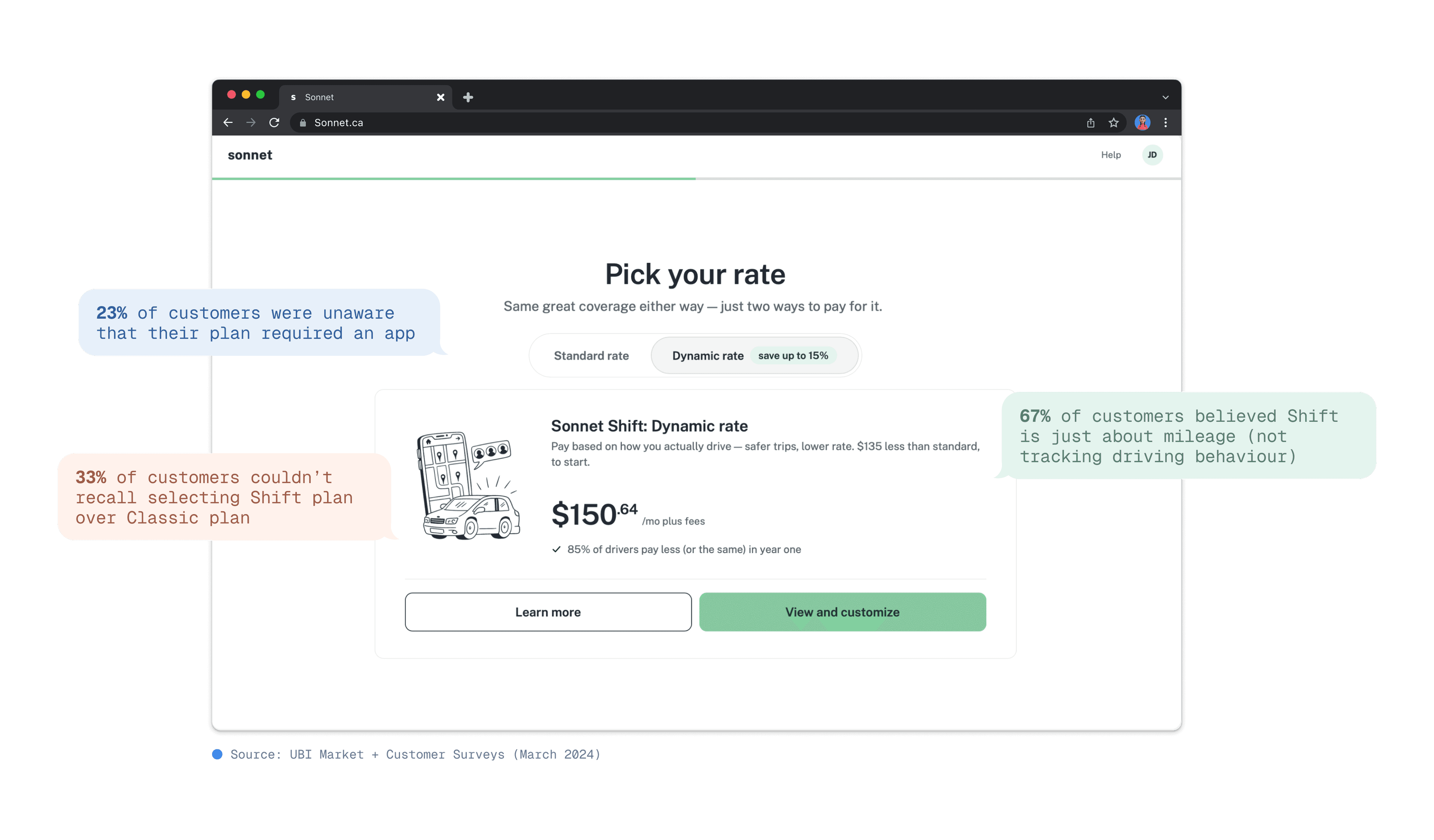
The leak: unintentional purchases
Customers buy for price but don’t realize they need an app.
The root cause
Price-conscious customers were speed-running through checkout, selecting the cheapest option without fully processing what they were committing to. The low price was the hook. The app requirements weren’t being absorbed during the quoting flow.
This created a “surprise-and-reject” moment post-purchase, when the app requirements became real.
How might we
...educate price-driven customers about Sonnet Shift's app requirements at the moment of decision — without killing conversion — so they choose intentionally rather than accidentally?
Discovery & research
Mapping the highest-leverage moment
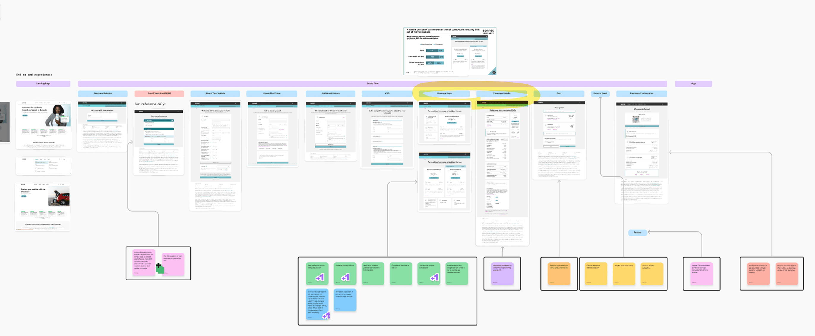
Through stakeholder workshops and an audit of the quote flow, confirmation screens, and onboarding emails, we identified the page where customers first saw the product and price. That’s where the decision was being made — and where we needed to intervene.
Step 1 – Internal Audit
Audited key customer touchpoints — quote flow, confirmation screens, onboarding emails, and CMS — to map the current experience.
Step 2 – Identify Friction
Whiteboarding sessions surfaced the biggest pain points: unclear package names, missing onboarding guidance, and underemphasized benefits.
Step 3 – Collaborative Ideation
Ran workshops to explore UI and content improvements — from updated landing copy to contextual incentives that build trust and communicate value.
Step 4 – Prioritize Focus
Zeroed in on the moment that matters most: the page where customers first see the product and price, and decide whether to buy.
Three design opportunities
The bet
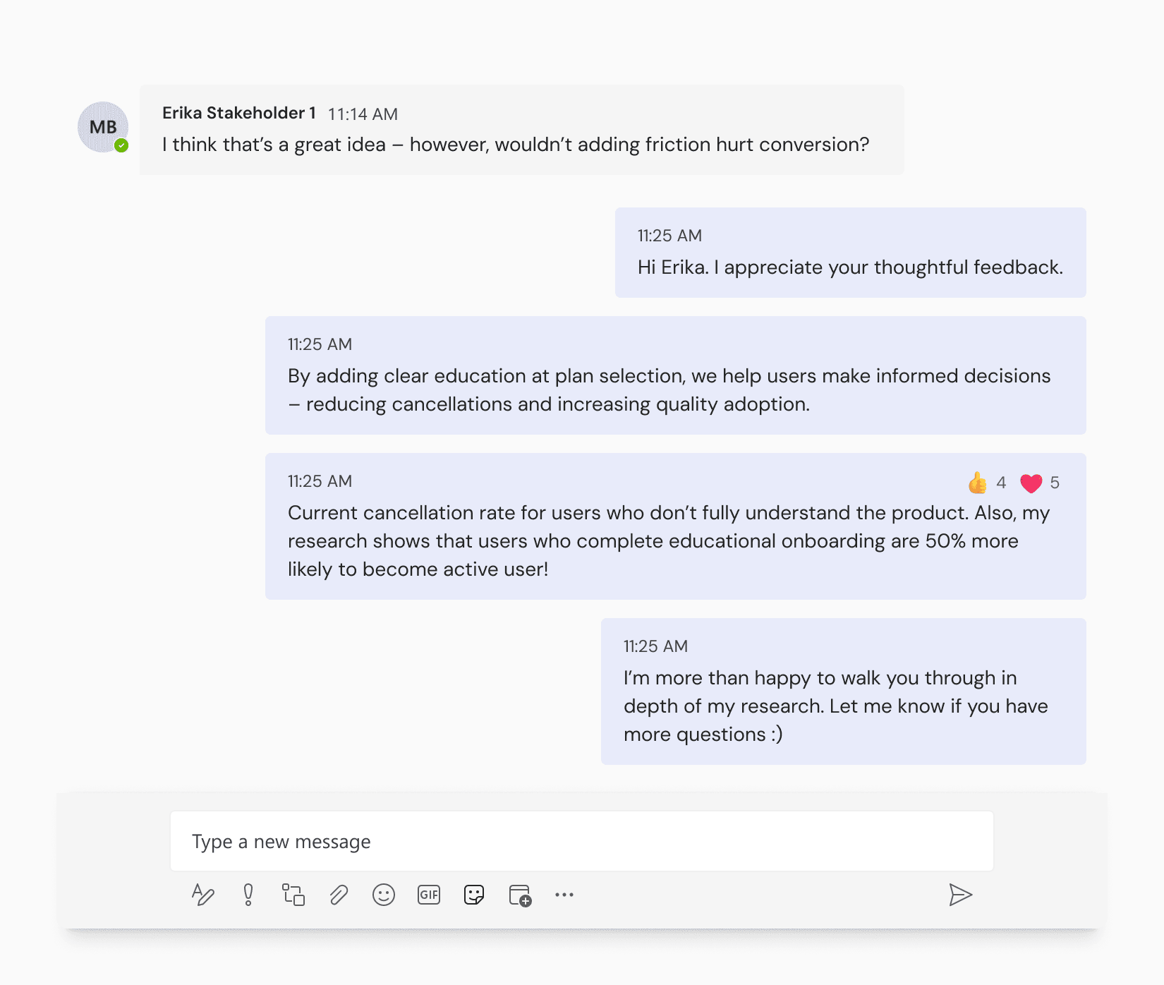
Some stakeholders assumed adding friction would hurt conversion. I argued the opposite: the right friction would improve business outcomes.
Customers who truly understood the product and still chose it would be more valuable than customers who selected it by accident. Intentional users would activate the app, engage with the program, and stay enrolled. Accidental users would cancel — exactly what was already happening.
This was counterintuitive. But the data we had on cancellations supported the hypothesis. We tested it.
Exploration
Two prototypes, two philosophies
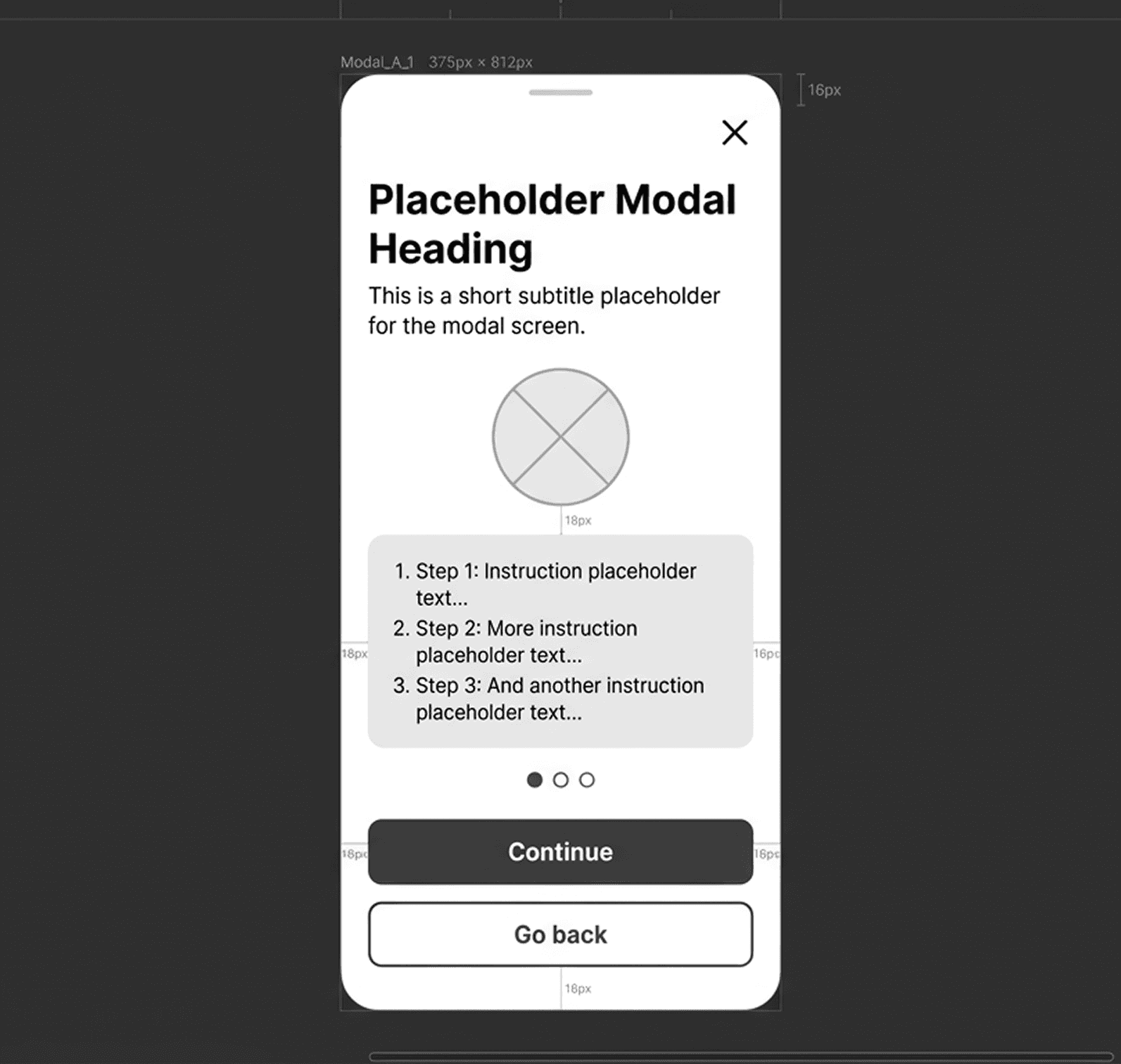
We developed two distinct educational interventions for the moment users selected the Sonnet Shift plan.
Prototype A — Sequential modal. Three focused screens, one per concept (App installation, Trip monitoring, Premium changes). Forced progression ensured each piece of information was processed in order.
Prototype B — Interactive accordion. A single screen anchored by a short program video, with three accordion-style sections users could expand at their own pace. Active engagement instead of passive consumption.
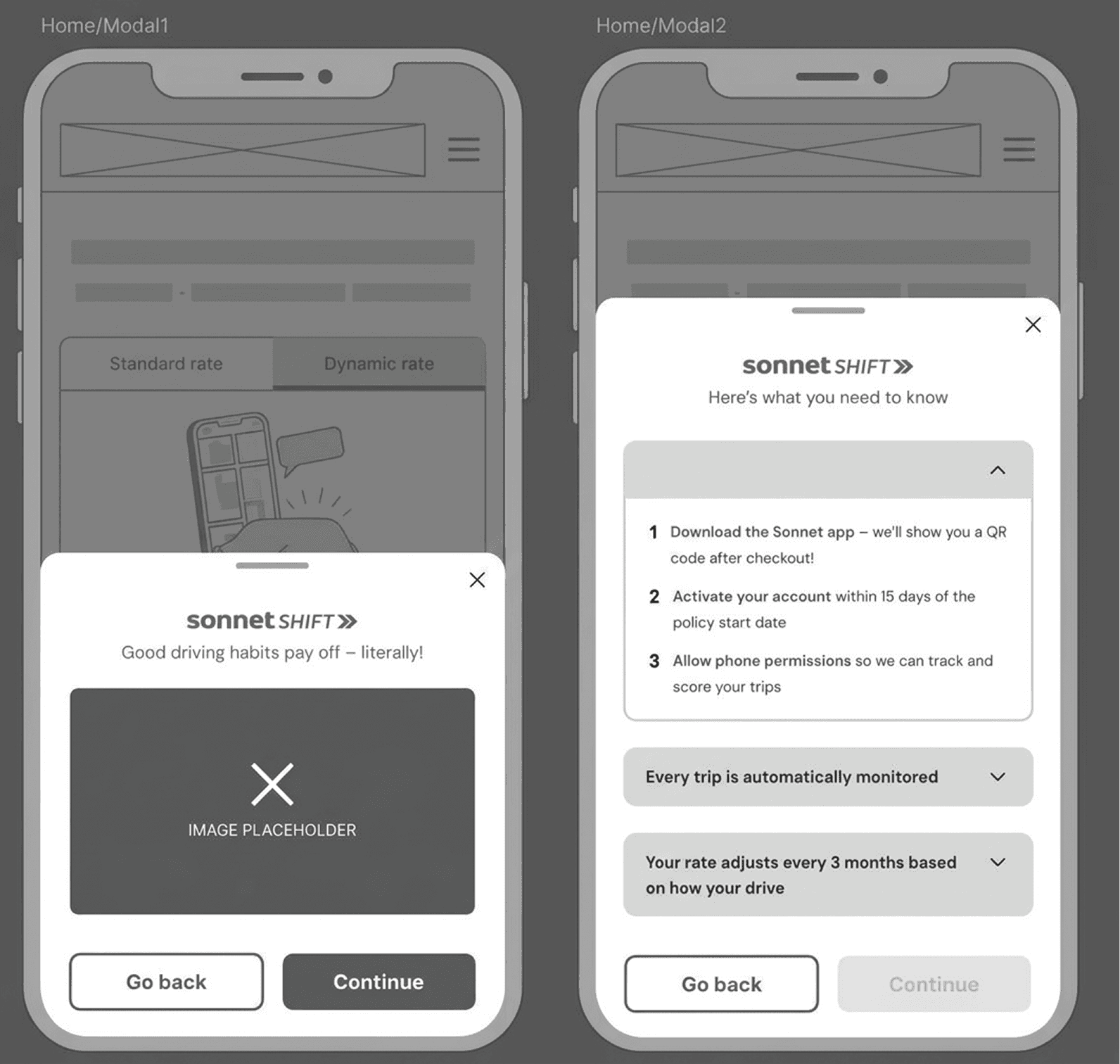
problem · users speed-run past app requirements
       │
       ├──  prototype A · sequential modal       →  forced progression
└── prototype B · interactive accordion → shipped · won testingTesting
Results
We tested with 17 participants in Ontario (6 desktop, 11 mobile).
100% of participants accurately outlined the key attributes of Sonnet Shift after interacting with the prototypes.
Modal B won decisively. 14 of 17 participants rated its layout “very clear.” Most participants preferred seeing all options on one screen rather than switching between them — the single-screen architecture reduced cognitive load by giving them a complete overview to process as a whole.
What participants said
“Overall, I think it was extremely clear. Everything was built off of another. I had a really good flow of information.”
— Test participant · Ontario · April 2024
Two follow-up needs surfaced for future iterations: stronger trust signals around data privacy, and an option to skip the intro video for users who preferred to read.
Therefore, armed with these actionable insights, the team had high confidence in moving forward with a refined version of the Modal B design for development and launch.
Learnings
I learned that great UX isn't about making things frictionless — it's about making friction meaningful. A simple education modal, placed at the right moment, gave users the full picture before they committed. They didn't feel pushed. They felt respected.
Takeaways
Testing with real users challenged my assumptions and directly shaped better design decisions.
I learned to use data not just to solve user problems, but to connect design decisions to measurable outcomes.
I wear many hats — Beyond design, I took initiative in synthesizing customer insights and aligning stakeholders to move the project forward.
Challenges
Limited resources — A small dev team meant constant prioritization and clear communication to maintain momentum.
No dedicated researcher — I had to quickly upskill in user research methodologies with little prior experience to fill the gap.
Broad responsibilities — Balancing design with customer insight gathering and stakeholder management stretched my capacity but broadened my skill set.